


Key Highlights
- Use proper settings to increase DTF transfer color brightness and clarity.
- Follow expert DTF print vibrancy tips for consistent results.
- Choose the best inks for vibrant DTF prints for better color output.
- Correct DTF transfer brightness settings improve final results.
- Apply proper techniques to increase vibrancy for DTF shirts.
If your prints look dull or slightly faded, you’re not alone. Many people struggle with getting bold, eye-catching results from their DTF transfers, especially in the beginning. The good news? Vibrancy is not about luck, it’s about control.
Once you understand what affects color output, you can easily make DTF prints more vibrant and achieve that sharp, professional finish customers love. From design settings to heat pressing, every step plays a role.
Let’s break it down in a simple and practical way so you can consistently improve your results.
Why DTF Prints Sometimes Look Dull
Before fixing the issue, it’s important to understand the cause. Dull prints usually happen due to incorrect settings, low-quality materials, or poor technique.
Even if your design looks bright on screen, it may not translate the same way onto fabric. That’s why learning how to increase DTF print vibrancy is essential if you want consistent, high-quality results.
Start with High-Quality Design Files
Everything begins with your artwork. If your design is not strong, your print won’t be either. To truly improve DTF print color, your file needs to be sharp, well-balanced, and properly prepared.
Design Tips for Better Vibrancy
- Use high-resolution images (300 DPI)
- Avoid dull or washed-out colors
- Increase contrast slightly
- Use proper color modes
These steps are part of a solid DTF vibrant colors guide and directly impact your final output.
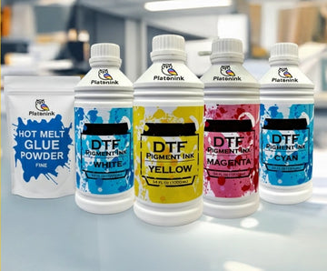
Choose the Best Inks for Vibrant Results
Ink quality makes a huge difference. Using low-grade materials will always limit your results, no matter how good your design is.
Investing in the best inks for vibrant DTF prints ensures deeper colors, smoother gradients, and better durability. High-quality inks are a key part of effective DTF transfer color optimization.
Optimize Your Printer Settings
Your printer settings play a major role in color output. Small adjustments can help you increase DTF transfer color brightness significantly.
Key Settings to Check
- Ink density levels
- Color profiles (ICC settings)
- Print resolution
- White ink balance
Fine-tuning these settings is one of the most effective DTF print vibrancy tips you can follow.
Perfect Your White Ink Layer
White ink is the base of your design. If it’s not applied correctly, your colors won’t pop. A strong white base enhances brightness and helps you make DTF prints more vibrant. Without it, colors may look faded or transparent on dark fabrics. This is a core part of any DTF vibrant colors guide.
Use the Right Film and Powder
The quality of your film and adhesive powder also affects vibrancy. Poor materials can reduce color sharpness and durability.
Using premium supplies improves adhesion and helps maintain strong colors. This is an important step in DTF transfer color optimization.
Master Heat Press Settings
Heat pressing is where everything comes together. Even a perfect print can look dull if pressed incorrectly.
Learning the best settings for vibrant DTF prints ensures your colors stay bold and sharp after transfer.
Ideal Heat Press Tips
- Use correct temperature and pressure
- Avoid over-pressing
- Follow recommended timing
- Re-press for better finish
Correct DTF transfer brightness settings during pressing can significantly improve results.
Post-Press Finishing Techniques
Finishing is often overlooked, but it plays a big role in the final look. Proper finishing techniques can enhance shine and depth.
Finishing Tips
- Re-press with parchment paper
- Allow proper cooling time
- Check edges for full adhesion
These steps help improve DTF prints color punch and give your design a professional feel.
Fabric Choice Matters More Than You Think
Different fabrics react differently to DTF transfers. Cotton, polyester, and blends can all affect how colors appear. If you want to increase vibrancy for DTF shirts, choose fabrics that support better color absorption and contrast. Smooth surfaces usually produce the best results.
Common Mistakes That Reduce Vibrancy
Avoiding mistakes is just as important as following the right steps.
- Using low-quality images
- Incorrect color profiles
- Weak white ink layer
- Poor heat press technique
- Low-quality supplies
Fixing these issues will instantly improve DTF print color and consistency.
Pro Tips to Boost Color Punch
If you want next-level results, follow these advanced tips:
- Slightly increase saturation in design software
- Use color correction tools
- Test prints before bulk production
- Maintain your printer regularly
These are proven DTF print vibrancy tips that help you stand out in a competitive market.
Final Thoughts on Vibrant DTF Prints
Achieving bold, vibrant prints is not complicated, it just requires attention to detail. From design to final press, every step contributes to the final look.
Once you understand how to increase DTF print vibrancy, you’ll have full control over your results. Over time, these small improvements lead to better products, happier customers, and stronger business growth.
Conclusion
Vibrant prints are what make your designs stand out and attract customers. By focusing on quality materials, proper settings, and consistent techniques, you can transform your DTF transfers into professional, eye-catching products.
Whether you’re a beginner or scaling your business, mastering these steps will give you a clear advantage. If you’re ready to upgrade your printing quality and get reliable solutions, explore Bostonian DTF.
FAQs
1. How to increase DTF print vibrancy?
To increase DTF print vibrancy, use high-quality designs, proper color settings, strong white ink layers, and correct heat press techniques. Consistent testing also helps achieve brighter and sharper results.
2. What are DTF print vibrancy tips?
DTF print vibrancy tips include using high-resolution images, optimizing printer settings, choosing quality inks, and maintaining proper heat press conditions for better color output.
3. How to improve DTF print color?
Improve DTF print color by adjusting color profiles, increasing contrast, using better inks, and ensuring proper curing and pressing techniques for consistent and vibrant results.
4. What are the best settings for vibrant DTF prints?
Best settings include correct temperature, pressure, and ink density. Proper ICC profiles and white ink balance also help achieve brighter and more vibrant prints.
5. How to increase DTF transfer color brightness?
Increase brightness by optimizing printer settings, using strong white ink layers, and selecting high-quality inks that enhance color depth and clarity.
6. What is DTF transfer color optimization?
DTF transfer color optimization involves adjusting design, printer, and heat settings to achieve accurate, vibrant colors and improve overall print quality.
7. What are the best inks for vibrant DTF prints?
The best inks are high-quality, pigment-based DTF inks that provide strong color output, smooth gradients, and long-lasting durability.
8. What are DTF transfer brightness settings?
DTF transfer brightness settings refer to adjustments in printer and heat press configurations that affect how bright and vivid the final print appears.
9. How to increase vibrancy for DTF shirts?
Increase vibrancy by using proper fabric, strong white base layers, and correct heat press settings to ensure colors appear bold and long-lasting.
10. What is DTF print color punch?
DTF prints color punch refers to the intensity and brightness of colors in a design. Strong color punch makes prints look bold, sharp, and visually appealing.


