


If a vivid DTF design has ever been printed and the finished product appears drab or "off," you're not the only one. One of the most frequent annoyances for designers and print shop managers is a DTF color mismatch. On your screen, your design appears flawless, but the final DTF print conveys a different message.
So what gives? More importantly, how can you resolve the issue when DTF colors don't match your screen?
Together, we will explore the realm of DTF color correction and assist you in producing prints that accurately reflect your vision.
Understanding Why DTF Colors Don’t Match Screen
First, it’s important to realize that your screen and your printer speak two different languages.
- Screens use RGB (Red, Green, Blue) color profiles.
- Printers, including DTF printers, use CMYK (Cyan, Magenta, Yellow, and Black).
This conversion between color spaces is often where problems arise, creating a screen vs print color difference that’s hard to ignore.
And beyond that, other factors like ink quality, temperature, film type, and heat press settings all play a role in DTF color accuracy.
Common Causes of DTF Color Mismatch
Here are the biggest culprits behind those frustrating color surprises:
Your Screen Isn’t Calibrated
-
Your expectations for color might be thrown off by temperature, contrast, and brightness settings.
No Color Profile Embedded
-
You'll lose accuracy if your design program isn't configured with the right color profiles.
RGB design Rather than CMYK
-
RGB frequently creates colors that are difficult for CMYK printers to replicate precisely, which makes the DTF print appear different from design previews.
DTF Printer Color Management Not Configured
-
Many printers need ICC profiles or manual adjustments for proper color management.
Wrong Heat Press Settings
-
Incorrect time, pressure, or temperature can mute or shift colors.
Tips to Fix DTF Color Issues and Get Accurate Results
Here’s how you can start adjusting colors in DTF designs and improve your overall color output:
1. First, adjust your monitor.
Use tools like Datacolor Spyder or X Rite to calibrate your screen. This ensures what you see is as close to reality as possible.
2. Work in CMYK Mode When Designing
Many designers work in RGB by default. Switch to CMYK early in your workflow so you're seeing a closer representation of what will print.
3. Embed ICC Color Profiles
Check for embedded ICC profiles in your design program (such as Photoshop or Illustrator). This helps bridge the color gap between digital and physical outputs.
4. Test with Color Charts
Print DTF color charts and compare them to your screen. Adjust accordingly to build your own visual reference.
5. Use Consistent DTF Printing Conditions
Maintain the same heat press settings and humidity conditions. DTF transfers color issues including dullness or unexpected tints might result from this inconsistency.
6. Update the firmware and printer drivers
Your most recent color profiles might not be supported by outdated software. Keep things current to avoid unexpected issues.
Why DTF Colors Look Dull (and How to Fix DTF color issues)
Ever wonder why DTF colors look dull even when your artwork pops on screen? Here are some extra tweaks:
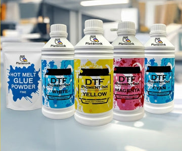
- Use high opacity white ink as a base layer.
- Check that your powder is fully cured, not undercooked.
- In your design, add a little more contrast and saturation, but not too much.
- For optimum results, use bright inks and high quality PET film.
Best Color Settings for DTF Printing
If you want clean, bold, and accurate prints, the best color settings for DTF printing usually include:
- CMYK color mode
- Make use of Adobe RGB (1998) or sRGB IEC61966 2.1 as your screen profile.
- ICC profiles that are integrated with your printer model
- Proper RIP software (like Acrorip or CADlink) to manage color output
Conclusion
Getting perfect colors in Bostonian DTF printing isn’t a guessing game. With a little knowledge and calibration, you can bridge the gap between digital screens and real world prints.
Don’t let DTF color mismatch keep you from creating the vibrant, true to design results your brand deserves. Implement these fixes, and your prints will pop with the precision your customers expect.
Frequently Asked Questions
1. Why don’t my DTF colors match my screen?
Your screen uses RGB and your printer uses CMYK. Without calibration and profiles, you’ll likely face color mismatches between your digital design and printed result.
2. How can I improve DTF color correction?
Start with monitor calibration, switch to CMYK color mode, embed ICC profiles, and maintain consistent press settings to boost DTF color correction accuracy.
3. What causes my DTF print to look different than design?
The difference comes from uncalibrated screens, poor printer color management, and RGB to CMYK conversion errors. These all make your DTF print looks different than design previews.
4. Why do my DTF colors look dull?
Dull colors result from under cured ink, bad film, poor powder adhesion, or weak saturation in your design. These all contribute to DTF transfer color problems.
5. What are the best color settings for DTF printing?
Use CMYK mode, embed ICC profiles, and print through reliable RIP software. These are the best color settings for DTF printing to ensure vibrant, on point results.


